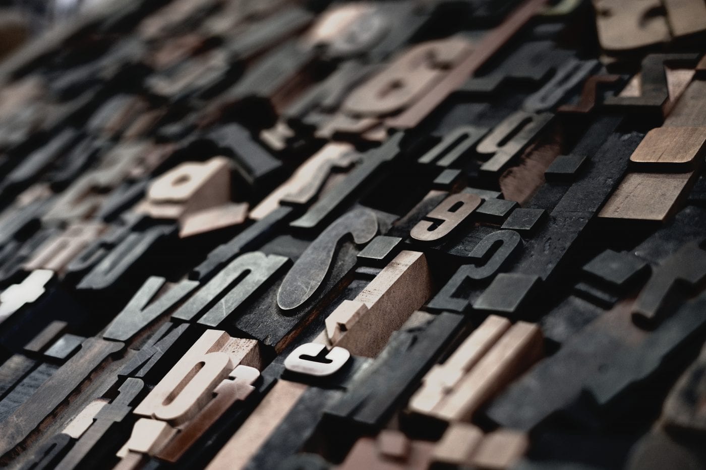
Do you know the difference between an m-dash and an n-dash? What about a hyphen? Differences such as these are probably perceived by your eyes and brain on a daily basis, and they affect the nature of how you process content- but it is unlikely that you spend considerable time pondering their intricacies. When choosing a font, it is critical that you consider these factors. Every letter and curve tells its own story in beautiful art that deserves respect.
When creating a new font, you don’t just run through the 26 letters of the alphabet, but must make 250 glyphs. Each glyph has unique metrics and rules which must be defined. This involves the hard work of an artist and should be considered as an artist’s intellectual property. Every serif (the wings of a letter), curve, dot, and dash, is measured out for circularity, angle, thickness, spacing, and juxtaposition, in a manner that evokes subconscious thinking patterns in the reader. These psychological effects must be measured according to their contextual implications. For example, Helvetica is a very factual font. You might not see it in a whimsical children’s book.
Developing and honing your perception of fonts and their beauty is essential to designers, marketers, and technology professionals, especially at a time where we have such an evolving diversity of selections. With this diversity, however, it is also important to recognize when a font is poorly designed and/or used out of context. Always be looking for a font you can look at and say “gee, you’re just my type!”


