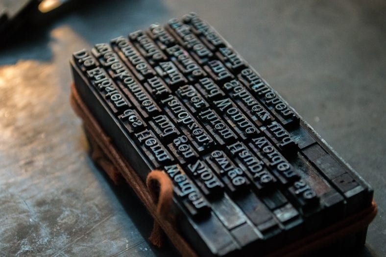
Today, on Episode 12 of The Edge of Innovation, we look at the history of typography and the effect of changing technology on graphic design.

Show Notes

A One-Man Font Shop
The Coolest Font of the Year?
The Feds are Killing Off Clearview
A Font Made Exclusively for Coding

Transcript

Sections

A Game-Changer for Graphic Design
A New Process for Custom Fonts
The Beauty of Good Fonts
The Founding Fathers of Font
Alignment, Leading, and Linotype
Just My Type
Low Resolution

Introduction

Paul: This is the Edge of Innovation, Hacking the Future of Business. I’m your host, Paul Parisi.

Jacob: And I’m Jacob Young.

Paul: On the Edge of Innovation, we talk about the intersection of between technology and business, what’s going on in technology and what’s possible for business.

The History of Computer Fonts

Jacob: Paul, one of the things that many people might not know about you is that you are very fascinated and passionate about fonts and typography. It’s maybe something that people don’t think about a lot, but the words that they read are in a specific font, regardless of where they’re reading them, even if they are graffiti on the wall, there is a font chosen for that. Talk us through what exactly typography is, why you’re passionate about it, and then just fill us in on why it’s so fascinating.

Paul:  Well, okay. I think we need to go back in time a little bit, back before the Mac. You know, back into the ancient of days.

Jacob:  Are we talking like Gutenberg days?

Paul:  No, not that far back, but Gutenberg was a very important guy. So back in the early ’80s, late ’70s, I grew up in a home where my dad was a draftsman. So, we had somewhat an appreciation of drawings and things like that. And you know, I took in high school, I took some graphic arts classes, and that was cool. You would have people doodling on notebooks and stuff. And I would always doodle letters and things like that. And never really thought much about it.

As the computer revolution started to happen in the mid-’80s, all of a sudden… I mean, you have to understand, at that time, when you typed something, you had the font that was in your typewriter. It wasn’t something you thought about. Certainly, the normal, common man didn’t think about it. They weren’t thinking about, “What is the look of this?” Or “What is the feel of this?”

But there were a whole group of people called graphic designers who did that every day. You know, and it was a very thriving community that thought about what colors work, all these design things that happened. And you know, you can see that when going and looking at old magazines or old designs.

A Game-Changer for Graphic Design

At the time the Mac came out, it produced some tools that all of a sudden, we could change the font of things. That was a new notion for most people. They didn’t have that liberty. And honestly, you know, a graphic designer before that, used what are called dry transfer letters. It’s a piece of plastic that’s transparent and has whatever color, usually black, type. So, you’d have a row of As, a row of Bs, a row of Cs, and lowercase, and uppercase. And you would draw a line, and you would put that piece of paper, that piece of plastic on top of it, align the baseline, and burnish it with a little round nodule at the end of a pen like, onto the paper or design you were working on. And then you’d go, and you’d slide over the… You know, if you were saying I was going to put the word type, t-y-p-e, I’d find the ‘t’ and I’d burnish that one on. I’d go find the ‘y’ and then burnish that one on, etc.

And it was tedious, and I was a lot of work. And that’s all we had. That’s what it was. So, now, all of a sudden, you know, you could sit down at this Macintosh thing, and you know, it was weird, because the Macintosh had a very small screen. And it wasn’t even big enough to really visualize a piece of paper on. And some people say that the WYSIWYG of the Mac was what was really cool, and it was a takeoff on the Xerox Star system that had a big screen that was visual. What you see is pretty much what you got.

And so these technologies were brought into normal people’s lives, or purview, and they could now see something on there. But the real big thing that made the difference wasn’t the Macintosh. It was the laser writer.

Steve Jobs wanted to create a laser printer that could print the things that were on his screen. That was difficult, and he identified at the time a company called Adobe Systems that had invented this thing called postscript, which was a way to render typography, or fonts, or shapes in a laser printer. Canon had developed a laser printer, an engine, basically a mechanized unit that took laser and reflected it using a mirror across a photosensitive drum. And by turning that laser on and off, it happened to do it at 300 dots per inch. So, 300 samples per inch, horizontally and vertically.

And if you think about it, if I ask you to move a piece of paper 1/300ths of an inch, stop, wait until the laser comes back and then move it another 300ths of an inch, you’re going to say, “Gee, that’s pretty hard.” And that was, that was really hard. So, they had to have some really incredibly precise timing and incredibly precise gears and mechanisms so that, once it started, continued going through that.

So, Steve said “How are we going to get this image on the screen to be an image on a printer?” And you know, there was dot matrix printers that made very low resolution, you know. They were maybe 72 dpi, or in that range. You could see the dots with your human eye. Whereas a laser printer, you could begin to imagine you didn’t see the dots. And it was revolutionary.

Up until that point, typesetting was done with either cathode ray tubes, projecting things onto a film, that film being developed with a developer, or it was done with, eventually, lasers as well. But you know, that was how typesetting was done. And it was complicated, and it took a lot.

So the laser printer. You know, again, Canon built the laser printer. It could make marks on a piece of paper through this laser system of hitting a drum and picking up the toner and then transferring that toner to the piece of paper and then fusing it into to, melting it into the piece of paper.

That was a huge thing. So HP also used the Canon laser printer. And they came out with the HP laser jet one, actually called the HP LaserJet, and it had fonts like Prestige Elite. Basically, it was just like a typewriter. It had those fonts built in. And you would have all these business people buying them to basically emulate their typewriters. And so they actually, in the laser printer, would have a cartridge that had a bitmap layout of the font. So, it would be like you taking a screen door and filling in the dots so that it would look like the letter ‘A’ and they would store that in memory.

And for the different fonts you’d want, you’d buy a different cartridge. So, you know, at the time, you might have one of the big fonts was Orator. It was, it was just a very, it was a monospaced font, and etc. And then IBM had a whole bunch of fonts in their electric typewriters.

A New Process for Custom Fonts

So, the laser printer emulated, basically, a typewriter. And what the marrying of postscript was is that it did it differently. It didn’t store fonts as bitmaps. It stored them as outlines, mathematical representations. So, now I could do some cool things with that. I could scale that font. So, I could make the letter ‘A’, which you’ve got to remember, these are tools that are being put into people’s hands. They used to have to go to a piece of plastic and burnish off the letter ‘A’. Now if they said, “Gee, I want an ‘A’ that’s four inches tall,” does the company… Letraset was the company that made these transfer things. Do they even make one that’s four inches tall?

So, I might have to go to the photography guys, have them take a picture of it and then blow it up and then cut that out and put it on the piece of paper. It was just very tedious to be able to use these different things. So the Macintosh married all of these things together. Postscript was key to its success. So, what it did is it took the bitmap image, or it actually took the postscript and rendered it on the screen, and then you could push a button, and it would render it on the printer, which was a postscript interpreter.

And so, all of a sudden, we, people who were creative, had tools that they never had imagined before. It was just completely revolutionary. You had a bunch of people who weren’t conditioned to think graphically. They consumed things in the marketplace. But they weren’t thinking about, “Huh, what font is that?” Or, “What font is that?”

During the early days, you know, I think there were like eight original fonts in LaserWriter: Times Roman, Helvetica, Palatino, I think was there, Zapf Chancery, Zapf Dingbats.

Jacob: Wow. I can’t believe you remember these.

Paul: Yeah. I’m trying to think of what else there might…

Jacob: Comic Sans? Our favorite font.

Paul: No, Comic Sans was not there. No, it was not.

Jacob: I mean, we could break into a rant on Comic San, should you want.

The Beauty of Good Fonts

Paul: No. I have a different opinion of Comic Sans. I mean, it’s an illustration of tools, you know. So, you know, people choose that. More offensive to me is people using Zapf Chancery and using it in all caps. Because it’s never… It wasn’t intended to do that. You know, an initial cap and then all lower case. And, and the second thing that bother me a lot is people using Times Roman. I just… It is so overused. People who use it don’t realize what they’re doing, the crime against humanity that they’re committing.

Jacob: Right. Well, I mean, is Times Roman the standard font for like all email?

Paul: Not necessarily. It depends on the client, the email client. But…

Jacob: Because I’m just thinking that potentially, we’re offending 90% of our listeners.

Paul: Well, that’s fine. I mean, they need to be. If they’re using Times Roman, it says that they’re really not looking at what they’re doing.

Jacob: I said to you earlier that when I get emails in Comic Sans or Papyrus, I immediately judge the person.

Paul: That’s true. That’s legitimate and reasonable. You know, you think there’s a font-ist mentality that is legitimized in some of these actions.

But you know, what’s interesting is Times Roman derives itself from the London Times. It was the font that they commissioned to have created for them. And if you look at things set in Times Roman properly, it is beautiful.

Jacob: Oh, yeah. I mean, I remember looking at books that are set in Times Roman or some derivation of that. And it is very aesthetically pleasing.

Paul: Right. Now the reason one might look at that like me, who is maybe a font Nazi, is when you look at it, the spacing between the letters, how they naturally set, those are what are called metrics. Different fonts have different qualities of metrics. And the quality of metrics for Times Roman has been pretty bad. And that’s one of the things is when you did typesetting, it was a group of professionals, who used very professional tools, to make sure that the letters were spaced properly, so that your eye would glide over them. And it would be, it would be beautiful.

The Founding Fathers of Font

So, anyway. So, let’s go back to the 1982, ’83 timeframe, and I was, you know, fascinated with graphic design. It was the greatest time to be alive, because all of sudden, we had tools to not have to do it… It would be like doing virtual carving. You know, if you did a carving project out of wood, you’re committed. You know, you make the wrong cut, you’ve made the same thing happened in graphic design. You cut the piece of paper. You lay it on there, whatever it is, and you end up with your result.

Now all of sudden I could do it, and I could do it five different ways in 10 minutes. And that was just amazing. And even more important, I could, I could stretch fonts. I could do all sorts of things. Now, you know, I mean, you’ve got to be careful. You could make it look bad and all that. So, all of sudden, I given not only tools, but power tools. So, instead of a whittling knife, I now have a chainsaw. Well, that’s a little bit gross. Maybe I have a Sawzall. Or maybe I have an Xacto saw. And I have all that in this one machine. And that was really a revolutionary change. And it was like, “Oh my gosh.”

So, then it became the situation where on the weekends, we would go driving around, and we’d go to used books stores. And I’d go see and find any of their old design books and font books. And that was really cool. You’d go in there, and you’d see these fonts that like, “Oh, this is really cool.” We’d go and scan them with a scanner and use them in our graphics and things like that. And then it became, “Well, how can I get new fonts for this?”

And there was this whole sort of indulgent time of, “What’s Adobe going to come out with next? What font? Oh, this font.” And you know, you’d go buy it or you’d get something that would come with a new font, it was like, “Oh, this is really cool.” It was just amazing. And they were all old fonts that have now been digitized. So, what you’d find — and Adobe was one of the major foundries. There was another one called Monotype and several others, and they would all digitize similar fonts, but they would do different metrics on them. And so one would look better and not. And we’d look at them. And it was like, “Oh, this is this. And this is this.”

And so, I remember in that timeframe, probably the ’85, ’86 timeframe, there was a group that was a members-only group based in Boston for typography, high-end typography. Roger Parker was there. He designed the typeface for Time Magazine at the time. They designed their own typeface. And then there was a company that started up in Cambridge called Bitstream, which was a new foundry. And it was going to be the digital only foundry, they created new fonts.  So, there was these, you know, traditional people who made fonts. Hermann Zapf, Zapf Chancery, he had a lot of fonts. He also had, I believe he did Palatino. He did Optima, I think, as well. You know, these people were contemporaries probably in the 1900s.

So forgive me if I got the date wrong, but when Bitstream formed, it was really under Matthew Carter was one of their primary designers. And he created a lot of really cool fonts, you know, and it was people working in Boston, doing that. Creating a font, you know, you may think that, gee, it’s sitting down and drawing 26 letters. Or 36 with the alphabet. You know, there’s about 255 glyphs, if you will. That’s what they’re called.

Jacob: Right. You have the letters, the numbers, the apostrophes, all that stuff.

Paul: And then there’s the upper and lower case. You know, so we have the upper and lower case. And then you also have, if you try this sometime on your computer, type the letter A in two lines and italicize one of them, and you’ll notice that the shape is completely different. Lower case ‘A’ has a circle around the top, it comes down, and then a bulb at the bottom. If you italicize that, it almost looks like an ‘O’ with a tail on it. And those are huge differences that you have to think about and, and do. And there are standards there.

And what a lot of people do is they will, they will italicize a font, or it will happen often, and rather than it changing form, because you have an italic version of the font, it will just slant the font. And those don’t look right. And they do impede the understandability of the text. You know, some people may never perceive this, but I do encourage you to look around and really think about this.

Now, you know, let’s roll back to say, if I wanted to typeset a page, a newspaper in 1975, how would I do that?

Alignment, Leading, and Linotype

Well, I would go and get a rack that would have a way in which I could align little pieces of type. I’d have a case next to me. It would have an uppercase and a lowercase. And I’d open the drawer to the uppercase, and I’d pick out the letter ‘P’, and it would look just like a letter ‘P’. It would be backwards, and I would put it in this rack, and then I’d go get the ‘A’ and the ‘U’ and the ‘L’ and put it — from the lowercase — and put it in there. And then I would block that type up. I might go and put spacing, if I had a second line, which would be called leading, so I’d add a little bit of space between them so that the characters didn’t touch top to bottom. And I would put this rack together, and I would tighten it up really tight. Then I could take ink and rub it on with a roller, and then put a piece of paper on there and then rub that with a roller, and then peel that off, and I would have a printed page. That’s what typesetting was.

Now, what came out after that was something called the linotype. A linotype was a machine that would take these molds and all that and basically allow you to take lead, because it was very malleable, melt it, because it melts fairly easily, and create a line of type. It would be a slug of type. It would be an inch long by about… Let’s say it was 12-point type. So, it would only be 12-point thick. And it would have type on it. You would be able to read it backwards. And it would be, you know, maybe an inch top, and then you would put that into a bracket and do the same thing. But it would do it lines at a time. So, that would make it a lot faster, and you could type it into a machine and do that, and it would set that type into that line. The previous line was you were manually setting it by hand.

Just My Type

And I have an interesting story. So, I grew up in a town near Buffalo called Batavia. There was a local newspaper called the Batavia Daily News. And I remember in fourth grade going and getting a tour of this. We went to the whole thing, reporters and all that. And we went in this dark, really hot room. And it was where the typesetters were. And they were taking away creating the type and setting the type for the newspaper. And there’s this pile of stuff they’ve been done with, with all the slugs or the leftover type. And it was a pile about maybe three feet in diameter, about two feet, three feet tall. And the typesetter, one of them, is standing there, and he says, “Oh, you can take a piece of type with you.”

And so, we all reached down and grabbed these pieces of type. And it was, you know, a little piece of lead, about one inch square, with type on one end, backwards. So, I pick up mine, and it has my name on it.

Jacob: Oh, no way.

Paul: Yeah. It was an article that was in that day’s paper of something at school, but it had my name. So, it was a really wild coincidence.

Jacob: Your full name? Like Paul Parisi?

Paul: Yeah, Paul Parisi.

Jacob: No way.

Paul: Yeah. And it was about me. I mean, it was, it was just the weirdest coincidence. I have it somewhere, this little piece of type. But that’s what it was. I mean, you took all these pieces, and then they would line up these lines, and then they would put lead shims in between them, the leading, again, and that would determine the line spacing. And so, you know, they could do all these different things. But imagine, they had a smelter. I mean, they were melting lead there. They were pouring it into molds and stuff like that. So, this little machine with this little screen, nine-inch screen, changed all that.

Low Resolution

Jacob: Yeah. The Apple…

Paul: Yeah. The Macintosh. But it wouldn’t have been… I mean, honestly, I was always underwhelmed by the Macintosh, because of its screen. And its resolution was low. It was infinitely better than everything we had before that, but it was very low. And it was always my question, you know, maybe ignoring the physics of the situation, just saying, “Why is it so, you know, lower resolution?” It’s like, why can’t I have really what you see is what you get, exactly?

And then, and then the battles started where people would come up with new solutions. And I remember in probably 1985 or 1986 there was a company that created a monitor called the Genius Monitor. And it was a paper-white display. So it was a white screen, and it was vertical, and it was the size of a piece of paper. And it was high resolution. So, it didn’t have 72 dpi. It was like 200 dpi. And it was like, “Oh, my gosh. I can see this is what the page is going to look like.” And it was really cool. And I remember getting one of those and using it, and it was so much more efficient and so much better.

But it’s really, screen resolution has been 72 or 96 dpi pretty much since the Macintosh came out and Windows 1.0 came out. And it wasn’t until they introduced the iPhone that Steve Jobs changed that and made a high resolution display. But, you know, when it came out, it was like, “What took so long?” I didn’t really understand what took so long.

Now, when you order a million initial units of an iPhone, you can order a screen that has a higher resolution to get the manufacturing cost down. So a lot of people still work on 1920 by 1080 screens on their laptops or on their desktops, and that’s the HD video screen. And because HD video is what everybody, every TV is, it’s easy to get scale and produce those monitors.

Now we have 4K or HD, you know, UHD, and that’s getting somewhere. That’s what I use myself, and it’s a much better experience. You see much… The dots disappear as in the iPhone retina displays.


Also published on Medium.