Category: The Edge of Innovation

24 Website Must Haves – Part 3

On Episode 15 of The Edge of Innovation, we explore web design best practices and discuss Paul’s new book on this topic.

Show Notes

Sign Up to Download Paul’s new eBook: “24 Website Must Haves”
Great Social Media Management Tools
“Stuff Business People Say”
Emo Philips Quotes
Programmers Imagine the Most Ridiculous Ways to Input a Phone Number
Tips for Killer Landing Page Design

Transcript

Sections

Content and Conversion
The Importance of Content
Jargon
Regularity
Conversion

Introduction

Paul: This is the Edge of Innovation, Hacking the Future of Business. I’m your host, Paul Parisi.

Jacob: And I’m Jacob Young.

Paul: On the Edge of Innovation, we talk about the intersection of between technology and business, what’s going on in technology and what’s possible for business.

Today on the Edge of Innovation, we explore web design best practices and discuss Paul’s new book on this topic.

Content and Conversion

Jacob: Thanks for joining us today on the Edge of Innovation. Last week we talked about Paul’s new e-book, 24 Website Must Haves. This week, we’re picking up from that conversation. So, if you’re checking in with us for the first time today, pause, go back, get last week. Catch up on what Paul talked about part one of his book, Getting Found Online, and part two, Designing Usability. That information was super helpful.

Today we’re going to be talking with Paul about part three and four of his book, 24 Website Must Haves. We’re going to be talking about part three, Content, and part four, Conversion. These are really important things for people with websites. If you’re a small business owner, we talked about this last week, how having a website is critical for the success of your business today.

So, Paul, would you pick us up on part three, Content? What do you mean? You start out by talking about messaging.

The Importance of Content

Paul: Well, sure. So, content is really everything. It is everything. So, if you went to Amazon, and they didn’t have any products, you wouldn’t be very happy. So, when you have a website, regardless of who you are, whether you’re the littlest guy or the biggest guy, company out there like Apple, or you’re a one-person, business with a blog, your content is what is going to provide the context for relationship with your customers. And that’s what’s important.

So, we’ve talked about messaging, we’ve talked about on our last, is when somebody comes to your website, what do you do? It’s got to was very clear. You don’t want to make them guess. What would you introduce your “Hi, I’m Paul. I’m this.” You want that message to come across.

Now, you may be introducing yourself wrong, and you may need to go through a process. We do this with a lot of clients. Why are you doing what you’re doing? What’s your goal here? Because, “Oh, I want to be a photographer.” Well, you’re introducing yourself as a photographer, but you really want to be a baby photographer. You know, so you might need to think about that.

So, you need to actually work with people that have them look at your site and give you feedback and test it. What is it saying? How is it saying it? And is it buried under 10 lines, or is it below the fold, below that screen that they can’t see? What do they get there? And that’s really messaging, making sure that it’s very clear. Making sure your headlines are clear and say what you want.

You know, we’ve talked about in the past, there’s different tags in html. H1 is the heading one. It’s the most important. There should be one on each of your pages, and it should tell you what the article that they’re reading is about. H2 should summarize the following section, and etc., down however many you need to go.

Jacob: Yeah. And I think that getting feedback from your customers is critical, because a part of messaging, while it might be clear to you, you need to make sure that it’s clear to your audience, that the people that you’re talking through understand the lingo that you’re using and that, so that the message is actually getting through.

Paul: Absolutely. And then, you know, it’s not enough to have a page that says, “I’m a photographer that does baby photography, and here’s 10 steps. Here’s 10 tips of getting good baby pictures.” It’s to ask them to do something. It’s called a “call to action”. You want to request that they do something. That’s the whole point of a website. It might be to follow you. It might be to engage you for business. It might be to share your information. But that’s… You’ve got to focus on what do I want people to do, and make it very clear.

And of course, testing all of that is critical. And there are tools that we use. You know, if you’re doing it yourself, it’s harder to figure out all of these moving pieces. But there are tools that will let you test things called AB testing. So, you can put up a call to action that’s one way and a call to action that’s another way and see which one performs better.

And tools will actually, as it figures out which one is better, it’ll direct everyone towards the one that’s performing.

Jacob: Gotcha. Yeah. So, along the lines of messaging and making sure that your message is getting really clearly through the people, what do you mean by educate and offer value?

Paul: Sure. Well the bottom line is people are far too busy to do something and not get anything out of it, whether it’s you read a story, and it was an enjoyable story, or if it’s a scary story, you were scared, and you were exhilarated by that, or if you watch a movie, and you thought that was fun, or you learn about how to take better baby pictures. That’s where you have to educate. You have to offer value, something that adds something to the person who’s consuming it. Not just…

You know, if you go in Times Square in New York City, there’s all these signs that are blaring at you. But they really don’t add any value. Whereas, if I can come alongside and say, “Oh, you’re really interested in, uh, you know…” I don’t want to beat photography to death, but “You’re interested in woodworking. Did you hear about this new tool?”

“Oh, no. I didn’t.” You immediately feel more informed and better. And that’s what you want to do in everything you do.

And you know, so many people, they say, “Well, I don’t want to give my secret sauce away.” I don’t agree with that. I mean, tell people what it is and what it takes. Uh, because first of all, if it’s simple enough to give away, somebody else has already figured it out. And if it’s complicated, then you’re saying, “Hey. I can do this.” And now you become an expert.

Jacob: Yeah. Not only are you educating, but then you’re also commending the quality of your services to somebody to say, “Listen. This widget over here is a new tool. I’m glad you know about it, but it does require a certain level of expertise to understand.” And simply by recommending it and talking with knowledge about something, you are immediately commending your own services to somebody, which I think kind of goes along the lines of what you’re talking about here with the importance of quality.

Paul: Yes, quality. Grade A Prime beef. 100% quality. Well, you know, it’s funny, but if I said to you, “You know, uh, one of these pieces of steak on this plate”—forgive me if you’re a vegetarian, but you’ve got the idea, “I dropped on the ground. And I don’t know which one it is. Do you want to eat? Come on.”

You know, you’d be like, “Oh, man,” you know, so you don’t get a lot of advertising out there that says, “99% quality.” You know, and that’s really the point, you know. You have to offer unique content. You have to write for the people, for people that are there. Write for humans. Provide value, as we just talked about, and keep it fresh. This is the hardest thing that I think people underestimate is they come out and they say, “I’m going to do a blog,” or “I’m going to do a blog on my website for photography,” or for whatever it might be.

It’s hard work. We actually write stuff for our clients that they can then edit, and help them to do that. And the ones that do it and follow through have tremendous results. The ones that don’t do that, don’t commit to that, are disappointed because they don’t have it. So, the, the quality, and you got to know that quality. You know, if you said, “Gee, you know, there’s a sale on 35mm film at this company in Newton, Mass.” You’d be like, who cares. I mean, you know, it’s not very quality information. Or if you tell bad information on top of it, that’s even worse. And then you’ll get shares that say they don’t know what they’re talking about.

Jacob: Then you’ll be building a website for a different company.

Paul: Exactly.

Jargon

Jacob: So, along the lines of quality, avoid gobbledygook.

Paul: Yeah. Exactly. And it’s, you know, all of these terms, all of these business terms. There’s a great video, uh, we should link it in our show notes.

Jacob: We will.

Paul: So, yeah, there’s a great video that really encompasses all of the words you shouldn’t use. And it’s called “Stuff Business People Say” by Tyler and Tripp.

Yeah. It is, it is excellent. And it is excellent. You know that actually might be one of those words. But, you know, actually we’re talking about next generation ideas that are flexible, you know, and robust and scalable and easy to use, cutting edge kind of things. You know, groundbreaking. I mean, this is…

Jacob: I always get so confused when, when marketing guys just start talking. I just have… I’m like, “I think I know what you mean, but that, that’s not how I usually think about it.”

Paul: Well, you know, when you write the content for your website, you want to be cutting edge, groundbreaking, and best-of-breed, mission-critical information. So, that’s just not how people talk. You know, it’s, it’s the equivalent of going into a car sales… You know, a car showroom and, “What do I got to do to get you into this car today?” That’s exactly what you just said. You’ve got to be real. And that’s really what we’re talking about is to avoid gobbledygook.

Jacob:  And I think that’s what you mean, even by talking about messaging before, is you have to understand who your audience is and what makes sense to them. And if using, for example, all this business-speak terms. Or, you know what it’s like to be around somebody that is really into boats, and they start going off about the boat language, and you are totally lost. My, my family is all military, and they start going off on all these military terms, and I’m just like, “I’m not in the military. I don’t know what you’re talking about.”

So, if you’re going to be successful at messaging for clients or prospective clients through your website, it has to be in language – not gobbledygook language – that’s normal for them.

Paul: And that me, if you’re going to a military audience, speaking military language.

Jacob: It might be. Yeah.

Paul: Both, but just these, these pontifical language, these things that we’re used to or do, you know, we’ve… Watch the video. It’ll change your life.

Jacob: It will be on the show notes. So, along those lines, you have this section on be clear, not clever.

Paul: Right. Exactly. And I think that’s… You know, there’s a lot of cognitive work done when consuming things. And people consume websites at a huge speed. You know, television is very different, because it feeds you at the speed it feeds you. The web, the person is in control of their perception.

Jacob: They’re skimming things.

Paul: They’re skimming things. So, if you’re trying to be clever, you know, you can throw a few jokes in here and there, but jokes, jokes don’t work as well as in writing as they do in delivery. And so, just be clear, you know. Just make it clear, easy to understand, good rule of thumb.

Regularity

Jacob: Excellent. So, we’ve been talking. We’ve kind of gone around talking about the category of blogging, regularly. You know, I made a joke earlier about how many blogs have the entry, “Sorry I haven’t blogged in while.” You were making reference to blogging is a lot of work. Talk us through any more details in this category.

Paul: Well, blogging is like, maybe we could equate it to having your own radio show. We’re on a podcast, having your own podcast. You know, whatever that might be. You have something to say. The more regular, the more consistent that that is, the better you will be perceived, and the more value you will contribute. Now some people… With a podcast, it takes time to consume it. They can’t, you can’t skim a podcast or a radio show. It’s time bound.

So, you know, blogs are not that way, though. So, to be able to come up and say what you think about a topic or, you know, gee, this, you’re in photography or woodworking, and this new thing came out and you give your 10 cents, or two cents, about it. And that can be very helpful.

Even blogging about what other people have said. Don’t underestimate the value of that. Because if you’re a photographer, and you’d say, you know, that there’s a great wedding photographer because you really don’t do wedding photography over in this town. You should talk to them. But that’s going to be looked on as hugely valuable.

So, blogging, though, the difficulty, I mean, you know, its aspects are it creates fresh content. It keeps people coming back, keeps them interested and engaged. You would socialize it across social media. It would drive more people in. They would share it. You will get more traffic that way, but you’ve got to keep doing it.

Don’t start one. I mean, it doesn’t hurt to start and do one blog, but you’re better off not done it.

Jacob: Yeah. Yeah. I think that’s a great way for a business, like you were saying. I love the example of commending other companies within your same industry, because it’s a way of building relationships. It’s a way of not only informing potential clients, but it’s also a way of doing a public form of networking that commends the quality of your business.

Paul: Absolutely. Yeah. Again, because, again, people want to be in the know. And they want good information. And that’s why you say, “Hey, you know, have you been to this restaurant?” You know, you could even, you know, do that in a small town or an area. I mean, we’re in northern, in New England, North Shore, Boston. And you know, if I’m a photographer, and I’m talking about… “Hey, you know, I had a really good experience at this restaurant in this town.” That is going to be hugely beneficial to you. It’s giving somebody a compliment, and you know, it could even be difficult situations. “I went in, I had a hard time, and they fixed it this way.”

You know, that’s hugely, hugely valuable.

Jacob: Excellent. And you were mentioning making content sharable and socialized. Talk me through that.

Paul: Well, you want to make sure that if somebody sees something on your website that they like, that it is second nature, trivial, for them to put it on Facebook, tweet it, whatever it might be that they are interested in. If you have a funny picture that you’ve put on your blog about a dog you took a photo of, and you want them to be able to share that, because that’s how the world works, is we tell somebody, and they tell somebody, and they tell somebody. So, make it easy.

And there’s technology to implement to do that, and that’s where you need to make sure you choose the right tools to do that.

Jacob: Yeah. And if you’re wondering, some very simple, basic tools, we’ll have links for Buffer and other sort of tools on the show notes at PaulParisi.com.

One of the things that brings up is multiple forms of content, because, clearly, you want to be engaging people, if you want to do it Facebook, Twitter, LinkedIn, those are very different types of contents.

Paul: Yeah. Absolutely. Well, not only are the channels different, but the… You just want variety. If you said, “Okay. You’re going to come over for dinner next week. Okay. Great.” We sit down, and we have potatoes. Okay, interesting. I ask you to come over again. You have potatoes. You’re like, “Huh. This isn’t…” You know, so to throw audio, video, pictures, pictures with text overlays, is going to spice things up.

Now, you know, there are a lot of bloggers who are very successful, who only blog. But I’ll bet they put pictures in their blogs.

Jacob: Or they blog and they’ve picked up Twitter and Facebook as alternative means or additional means.

Paul: Absolutely. So, that multiple content, you know, is critical, you know, to not just think… I mean, it might be a little bit scary if you’re doing a text blog and have done one for a long time to say, “I’m going to do a podcast.” And a one-off podcast isn’t going to was of much value to you. But if you did a video or whatever, but, you can include videos that you like. Like, I just talked about that Tripp and Tyler video. Well, put that in your blog.

So, now I’ve got varied media. So, somebody can share this. “Today Paul turned me on to this. This is really cool.” And that’s what you want to do. You want to leverage stuff that’s out there. You don’t have to create everything that’s there.

Jacob: And then, what do you mean by this category of customer proof?

Paul: Well, you want to make sure that what you’re doing is resonating. So, you want to continually test it. You want to talk to customers. You want to make sure that you put in your website stories from your customers. So, when somebody comes and is happy with your work, you do a testimonial.

Now, you may not want to do that, but you may want to have somebody else do that for you. But even doing it yourself. You know, have them write a simple, have a simple form are on there that says, “Compliments or complaints.” And you know, compliments, and if you get a complaint, I want to figure out how to make that a compliment. I want to transition them and win them back.

So, those are very powerful. You know, to have somebody say, “You know, I had a problem with this business, but they fixed it.” And then you might even want to think about, “Gee, let’s do a video of that or an interview with that person.” And it may be actually more genuine to have it be done by somebody else than you doing an interview, because it sounds self-serving.

Conversion

Jacob: Excellent. This is part three of Paul’s book 24 Website Must Haves, and we’ve been doing the first two sections, part one and part two in the previous episode. We’ve just been going over part three on content. Paul, I’d like to talk about conversion, because this is a part of —we’ve been alluding to this through the whole conversation, leading people into getting them correctly into a website, they find the website, you know, they like the website. They like what they see. They want to share it. Now we want to talk about conversion. What does that mean to convert them into, I’m presuming, a customer or audience member of some kind? Is that what you mean by that?

Paul: Well, yeah. You know, conversion can mean a lot of things to different people. There’s a great Emo Philips line where he’s sitting in a theater and somebody comes up to him and says, “Excuse me, sir. Is that seat saved?” And he looked at them, and he said, “I didn’t know seats could be saved.” You know, uh, so, Emo would say… If you haven’t heard Emo, and you don’t know him, go out and YouTube him.

He is a unique human being. But, you know, we have this concept inside of SaviorLabs, the company I want with, called People Story Action, and it’s very simple. We’re trying to take people, tell them a story, and promote them doing an action. And that’s really what conversion is, is what is the action that we want them to do?

And what you find in this whole inbound marketing era is we want them to have multiple conversions that have low thresholds for commitment. So, initially, it may be coming and reading your blog. And then it might be them giving you their email address. So, you can send them the next announcement of your blog. And you keep building that relationship, just as you would in person, and then after a certain amount of time has come, they might reach out to you, or you reach out to them with a special offer.

But the goal is every page you have should have a call to action and a conversion, something for them to do. It might be a simple quiz. You know, where you say, you know, do you own your own home? You know, it could be… You could think of it somewhat as death by a thousand papercuts, little pieces of information. But every page should be an opportunity for you to capitalize on conversion.

Jacob: Some of my experiences in the fundraising – and it’s called the stages of the yes where you get people to say, “Yes” at every stage. That’s not necessarily to same yes to financially giving. That’s obviously a fundraising world. But you’re talking about getting people to say yes to, “Yes, I’ll join the newsletter.” “Yes, I’d like to talk to you more.” “Yes, I’d like to share this.” It’s all stages of converting people into an action that is not only one that they resonate with but also one that you want them to do.

Paul: Right. And that’s often characterized as a funnel. So, you have a very wide funnel that has very low commitment, and then as you move down the funnel to the neck, where you actually are getting an engagement in them, and they’re saying that yes, I want to consider hiring you to do this. And that’s very important.

Jacob: Excellent. So, you started us out by, in this section of conversion, talking about effective calls to action. Talk us through that.

Paul: What is an effective call to action? If you put it at the end of your very long blog post, and you put it so that it’s not very clear what you want them to do. That might be just subscribe. Well, maybe it would be more effective to have the blog post put on the right hand column. Have a subscribe box. Simply things like that, rather than putting it at the bottom. I probably wouldn’t put it at the top, because that seems a little forward. But a little bit out of the norm, out of the freeway area of it.

And then, you know, as I mentioned earlier. I don’t know if it was in this podcast or the previous one, where the color… So, a red button is more effective than a green button in some tests. So, you need to think about that, and you need to make sure that you’ve chosen the right colors and that your call to action has a benefit to them. So, “Give me your email address so I can sell it,” isn’t a good value proposition.

“Give me your email address, which I will never sell, and I’ll keep you up to date on my podcast or my blog that you just enjoyed reading.”

Jacob: So, you’ve just kind of alluded to it, but a call to action – it’s sometimes abbreviated CTA- the call to action positioning. Is that what you were referring to then?

Paul: Absolutely. It’s critical. And we’re going to jump into the next topic, which is landing pages, which these are all sort of welded together. So, a landing page is a page that you have written. Let’s say you want to write the definitive article about how to mow your grass. Okay.

Jacob: I want to read that article.

Paul: Okay. Well, you’re a strange man. So, here’s the definitive article. And you go in there, and you’re fun, and you’re saying, “Now, this is the way to do it.” You know, you want the perfect lawn, you know, without chemicals, etc. So you write that article.

Now, how are people going to get to that website? Are they going to come to PaulParisi.com and search for lawnmowing? Probably not.

They’re probably going to search for the best way to mow your lawn. And you’ve figured that out. So, you come up in the first couple of entries. When they click on that, they’re landing on what’s called a landing page. Okay, so it’s some way to jump into your website.

Now, that landing page needs to do something. Give them the information and hopefully get some information from them. Every landing page should have a call to action on it. That call to action should get something back from them. Landing pages are typically very focused content, and they will be very clear about what the person is talking about. And then it might be a way for them to explore other things as well.

So, landing pages are critical, especially for businesses. It’s harder with the blog example. But if you have a product that says, you know, “Here is the ultimate lawn mower sharpener. You know, here it is.” You want them to be able to say, you Google sharpening lawn mower blades and they get to that page. And it says, “Buy now for 50% off because of our special deal here today.” I’m being a little bit crass, but, you know, that’s what that landing page would do. Buy it now. Here’s our testimonials, all the different things on there. You may not have a lot. You want to make sure you don’t put too much on there. But you want to make it very clear that, “Hey, you can buy this now.”

And then, there are some landing pages that you can’t even get to the rest of the website. You just stay right on that website, because you don’t want them to wander away without having given you their email address. And that happens with Amazon. When you go to Amazon and you say, “Proceed to the checkout,” you can’t get back. There’s no buttons to go back. You literally have to go to your browser button and click back. And that’s important, because they’ve found that if there was something else distracting them at the top that said, “Hey, why not buy new shoes?” You might go off there.

Jacob: And then not buy.

Paul: And never complete the purchase because you got distracted by a phone call. So, they want to, want to put the landing page is where you put rails up, guardrails up for people.

Jacob: Excellent. And then along those lines, you’re talking about this exchange of information. One, to get stuff, information, from people. That leads to the category of forms.

Paul: Yeah. Absolutely.

Jacob: Talk me through that.

Paul: Well, I mean form, you want to ask as few things as you can on a form. The more fields you have on a form, the more people are going to abandon that form. They should be crystal clear what you’re supposed to put in there. You know, one of my pet peeves is that there are some forms where they say, you know, first name, but it’s actually in the form field. So, when you… The minute you click in there, the word first name goes away, as opposed to putting it just above the field. And that’s okay with first name, but let’s say I’m on a form. I’m very interested in it, and I type in my name. I type in my first letter, and I, I don’t know why. Maybe I did something in another field, and I get distracted for two minutes. And I come back, and I can’t remember what the first one was. Was it my first name or my last name. Is it this, my email address?

That’s awkward. So, you need to have ways in which people can really understand what you want, because if they don’t, they’re going to abandon. Man, I’ve been in forms where you type in a phone number, and it says, “Gee, this isn’t in the right format.”

Jacob: Well, who cares?

Paul: Well… I mean, it’s written by a programmer. I mean, because you know, bless their heart, you know, programmers will do all this stuff, but it’s like, “Why wouldn’t you just let me put in what I want to put in?”

Jacob: Well, there was… Wasn’t there this funny article we were passing around a couple weeks ago of all the different ways that a programmer would come up with entering a phone number?

Paul: Yes, it was true. Yes, it’s… And how to not do it. You know, how to…the worst ways to do it.

Jacob: Yeah. That link, for just pure fun will be in the show notes.

Paul: Yeah. So, make your forms very easy to understand. Make them work on mobile. Don’t ask too much information. Make it clear what’s required and not. I think there are… I don’t have them. I don’t know that I would research them, but I know that there’s been studies done, or people that know, the relative completion rates based on the number of fields. You know, and you’ve been in surveys before where they say it will only take two minutes to do this survey. And you click on the first page, and you do the first three questions. Then you go to the second page and there’s three questions, and you notice the thermometer bar hasn’t moved at all. And you just abandon it, because it’s like, “It’s not worth it to me.” You can’t do that, you know.

So, but what you can do is incentivize them – take very little information and incentivize them to come back in the future, and then ask them one more question. Do that a thousand times, and you’ll have a profile on the person that’s really cool.

Jacob: Excellent. So, then you have had this conversion. You’ve had them fill out information. And then talk me through this last category you have of newsletters.

Paul: Yeah. Newsletters is sort of the… It’s the blog of business. I mean, you know, blogs are typically identified with people and that’s important. But if you’re an executive and you’re a consultant in a heavy industry, it’s going to be weird if you necessarily have a blog. I mean, it might, if you’re saying, “I’m seeing these trends or, you know, these trends out there.”

But a newsletter is a different sort of take on that, because you know, “I’m the president of this consulting company. And I’m in the energy sector, and I see this happening.” Okay, that’s a great blog.

And newsletter might be, “We have seen these trends. We have seen this happen, this happen, this happen.” And it would usually could out on the same day of the regular, regular interval or whatever it is, that people can come to expect it. And I think that’s critical, for an organization to have a formal newsletter. The blog posts might be coming out transiently. You might have one week where you have one, and then it might be 10 days before you have the next one, whereas opposed to every Tuesday.

Now, you know, every Tuesday might be what you want to do as well. People are used to regularity.

Jacob: Yeah. It’s one of those things with newsletters. In some ways, at least for me, I can have associations of the old spam concerns. But I’ve increasingly seen marketers talk more about newsletters as being, in some ways, the best way to connect and message with your clientele, because in some ways, the email address, people’s personal contact information – especially the email addresses – is almost their most guarded piece of information, because they don’t want to get the spams. But then it’s also much more personalized because if you go on Facebook, Facebook is aggregating information in ways that might guard information from you or hide information that you’d want to see. Whereas with a newsletter, you’ve said, “I want to know what Paul Parisi thinks.”

Paul: Right. And it’s also, I think, a chance for them to catch up. Because with a blog, if I missed it, I missed it. But the newsletter actually might have a summary of the past month’s blogs. So, it’s a way in which somebody can say, I’m interested in this organization, this company, this person. Tell me what’s going on in one capsule rather than me having to have looked at everything. So, it’s a good way to get back in.

Jacob: Yeah. Excellent. Speaking of newsletters, if you would like to hear from Paul on a weekly basis, you can go to PaulParisi.com. We have the Edge of Innovation newsletter. We send that out every Friday morning. You can get that every week. We’d love to hear from you and to talk to you on a weekly basis. Another thing that would really help us out, if you would go to wherever you get your podcast from, and would you leave us a rating? We’d love to hear how you’re enjoying the podcasts. We’d love to see the rating, help us get connected with more people.

And speaking of sharing, please share the Edge of Innovation with all your friends and people that you think would be helped by Hacking the Future of Business, technology and business for the future of entrepreneurs and people who want to see their businesses grow in the digital age.

Thanks again for listening. We’ll see you next week.

My Kingdom for a Font!

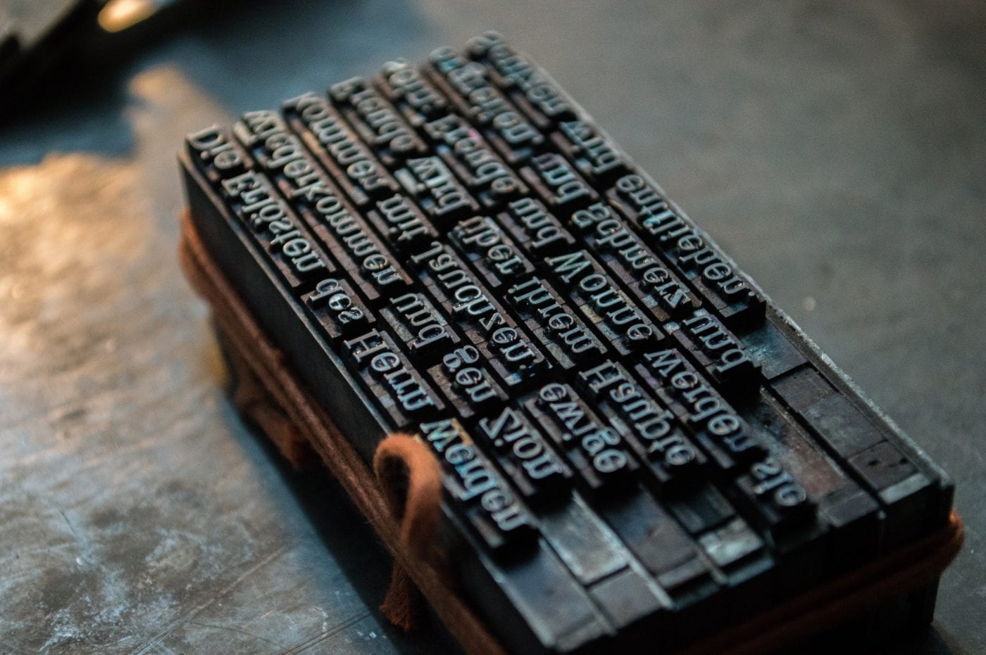
Today on the Edge of Innovation, we look at the history of typography and the effect of changing technology on graphic design.

Show Notes

A One-Man Font Shop
The Coolest Font of the Year?
The Feds are Killing Off Clearview
A Font Made Exclusively for Coding

Transcript

Sections

The Subtleties of Metrics and Spacing
Automatic Correction
Comic Sans, Roman, Tekton, Caslon
Powerful Programs for Typography
The Helvetica Documentary
Fonts Send a Message
The Importance of Typography
Introduction

Paul:      This is the Edge of Innovation, Hacking the Future of Business. I’m your host, Paul Parisi.

Jacob:    And I’m Jacob Young.

Paul:      On the Edge of Innovation, we talk about the intersection of between technology and business, what’s going on in technology and what’s possible for business.

The Subtleties of Metrics and Spacing


Jacob:  So, talk me through what exactly are the basic components that are important for typography. You mentioned the metrics.

Paul:  Well, yeah. I mean, metrics is just one and it’s how all the characters fit together in a line. There’s also this thing called leading we talked about, which is line spacing. There’s also kerning, which is adjusting the spacing between individual characters. So, if you set in a badly… You can tell the metrics of a font by typing out ‘AT’ in all caps. And what you normally want to do is have the ‘T’ crowd in next to the ‘A’, sort of overhang the space that the… You know, it’s getting into the A’s personal space. And that’s really where kerning comes in. And there’s all sorts of terms for all of these different things and how that might have been done, that harken back to the old way of doing it.

The biggest thing is, you know, picking a font that looks good. Now, that’s a perceptive… it’s a personal preference. But we have a lot of good examples of things out there. So, you know, there’s a book that came out when the Mac came out by Robin Williams, not the comedian, a writer. And it’s called The Mac is not a Typewriter. And this is still one of the best books, and you should read it if you have any interest in creating typographic work that looks good. And it talks about the difference between straight quotes and curled quotes.

So, if you quote something on a typewriter, there was one quote key. And there was a double quote. So, you’d type, “Today it is Monday.” And you want to quote Monday. You would put these hash marks that would be two little ticks up on the left and right of Monday. Well, in typography, the left hand one would be curved, sort of like an opening parentheses. And on the right hand side, like a closing parentheses. And it looks a lot nicer. And those are called smart quotes or typographic quotes.

And the majority of people out there may not even perceive that, but it makes a subtle difference. And the same thing with single quotes and single closing quotes and how we deal with that. So, this little book, you know, sort of summarized my five-year learning experience of reading all of these books on typography and how to deal with it and what to do.

A lot of these things, like Microsoft Word, will automatically use these curled quotes for you and will apply a lot of these rules, these typographic rules, for you. So, for example, one of the things that was always interesting is that people of my age and maybe a little bit younger, when they were taught typing, you would type a sentence, period, and hit the spacebar twice.

Jacob:  I was taught that. And I did it up until maybe in the last two to three years, when my wife railed on me for–

Paul:  Ridiculed you.

Jacob:  Yeah.

Paul:  Appropriately.

Jacob:  Yeah. Mocked me to no end. I must have been… And I learned typing on a computer, which…

Paul:  Interesting.

Jacob:  I don’t know why I would have learned the double space.

Paul:  Well, I think it’s because, again, remember when we talked about the HP laser printer which sort of emulated a typewriter? Typewriters, except for the very late models, were all monospaced in that a ‘w’ and an ‘m’ and an ‘i’ all took up the same width. So, in that pattern, double spaces after the period looked fine. But when you now start to say individual characters have individual metrics, the ‘i’ will be very narrow and the ‘m’ will sit next to it, and then the ‘e’ and the ‘t’ and the ‘a’, etc.

Putting that extra space after the period will cause gaps to appear in your manuscript. That’s why you don’t do it. So, one of the other things that a good typographer will look at — and this is really what happened. I worked with one for several years. They would edit the page, and they’d run it through typeset in what are called galleys. So, it’s a typeset strip of paper. So, let’s say your column width was two inches, and you had a book that was going to be six by nine, but you had two two-inch columns. They would take that two-inch column, cut off the first five inches, or nine inches let’s say, or eight inches, paste it on the pasteboard, and then take the next eight inches and past it next to it. And they would review all of that. Somebody would look at it and say, “Okay, this is good. This is good. This is fine.”

But they would also notice that there were what are called rivers of white. And that’s where spaces happen to line up as you move down the page visually, and you would see these rivers of white, similar to where you might end the line with the word Monday three times in a row, or even twice in a row. You don’t want that to happen. So, the way they’d fix that is they’d actually go back and edit the book. They would actually do that. They might cheat sometimes and put in an extra space here and there or kerning to do something, to make… You know, like if you had a line, and it had just one word at the bottom, that’s called an orphan. You might want to make that so that if we take out one word up above, it’ll cause that to sort of fall back into place.

And so, all of these things, you know, again, Word and all of the typesetting software out there helps you do all that, helps you avoid that. They’re not as good at helping you avoid rivers, but it can happen.

Automatic Correction

Jacob:  And is that the sort of stuff that Robin Williams the typography writer is helping us think through?

Paul:  Yeah, it does. It sort of calls out all of these things, the difference between a hyphen and an n-dash and an m-dash. So, for example, a hyphen is the dash that you use between phone numbers. Then there’s also an n-dash — which it’s named after the letter ‘n’ — is the width of the letter ‘n’ in that font. And an m-dash is the width of a letter ‘m’. Then you have open and closed ones. Open n-dashes means it has a space before and a space after, whereas a closed one means it doesn’t have a space before and a space after. And you get a different feeling based on that setting. It’s either open or tighter or not. But whatever you choose, you want to make sure you’re consistent in your manuscript.

Jacob:  I’ve noticed that with Microsoft Word, it automatically makes some of those adjustments when you’re typing through and it detects, “Oh, this should be an m-dash,” and it automatically lengthens it.

Paul:  Right. And you can turn those off and turn those on, if you want. But then there’s also ligatures. Ligatures are when two characters are set next to each other, they should actually change form. So, a typical ligature is an ‘f’ and an ‘i’. The ‘i’ — the lowercase ‘f’ and ‘i’. So, when you set a ligature, the ‘i’ sneaks back under the ‘f’. You take the dot off, and the curl that comes over is the dot for the ‘i’. And those are… Well typeset books 50 years ago, used ligatures. Word and most of the programs out there, can, if you know how to set it up, use ligatures, when it finds them. There are also some ligatures that will actually change style.

Jacob:  Yeah. The typesetting software I use for my important writing that I do, will automatically do that stuff — LyX and LaTeX — it’s written for engineers, but it does that stuff.

Paul:  Yeah. You’re crazy to use that. But…

Jacob:  Yeah. I mean, I enjoy it.

Paul:  I think it’s LaTeX, actually.

Jacob:  I’ve heard it pronounced “La tech.”

Paul:  Have you? Serious?

Jacob:  Yeah.

Paul:  I’m ignorant then. I don’t know. I… L-a-t-e-x.

Jacob:  Correct.

Paul:  It says ‘latex’ doesn’t it?

Jacob:  You have to be specific when you google search problems.

Paul:  That’s true. Can we get a phonetic response out there, please? Let us know how we say that word.

Jacob:  So, when talking about typography, so we’ve talked about how we’ve gotten to where we have access to all this typography stuff at our computer, and we’ve talked about what exactly is going on in terms of the dynamics between letters and going on in typesetting on a page. Beyond that, the technical details, what is communicated by typography? Is there certain tones and meaning that is brought out for the copy, the written content by a different typesetting?

Comic Sans, Roman, Tekton, Caslon

Paul:  Yeah. Absolutely. I mean, if you set something in Comic Sans, you’re not going to be taken seriously.

Jacob:  Definitely by me. By the way, and just to note on Comic Sans, I do think it’s interesting that while we do beat up on Comic Sans, it was actually written for dyslexia.

Paul:  Yes. Yes. And if you look at it, and you understand dyslexia, you can understand why. But I guess, yeah. It evokes a feeling. You know, it evokes a level of expertise or not. You know, if you wrote something in Tekton, which is basically it looks like an architectural font. It’s very informal. I mean, on a drawing, it looks fine. But if you were to write a book in Tekton, it looks informal, as opposed to if you write it in Galliard, which is very pointy. It’s a Serif face, but the Serifs… Just so you know, what a Serif is, is if you look at Arial or Helvetica, and you look at the capital ‘H’, the top of the ‘H’ is square. If you look at Times Roman, and you look at the capital ‘H’, it has these little Serifs, little things sticking out, almost like burs. And those typically, we use Sans Serif type for headlines and things like that, maybe road signs. And we use Serif type for the body copy. But Galliard has Serifs that come to a very fine point. Garamond is very thin. It’s very light and wispy. Times Roman is sort of a middle ground. Caslon. I’m in a happy place with Caslon right now. I like it, and I’ve been using it a lot. And it has nice rounded figures. It’s a fairly wide-set face.

There’s also this concept of x-height. The x-height is the height of the letter, lower letter, lowercase letter ‘x’. And each font has an x-height. And you could have the x-height be almost as tall as the capital height, or you can have it down 3/8th of the capital height. And so, it gives you a different feeling, you know, line by line, how you read that stuff.

Powerful Programs for Typography


And so, it all, it all adds up. I mean, you know, if you go and decorate a home and you don’t paint, and you’ve got sheetrock or plaster just open there, it’s going to give you a different feeling than if you have barn board, or if you’ve painted it and you’ve put in carpeting and things like that. All of those things add up to an experience. And, you know, I fear a little bit. I mean, we put these power tools in the hands of people who don’t even perceive they are power tools. You know, no fault of their own. It’s just, wow, I can do this. So they aren’t using typography to it’s advantage, and it’s not something… I mean, the best way…

You know, the guys who invented Ventura Publisher, which was one of the first powerhouse, high end electronic publishing tools on the PC. It was three guys who basically sat down in one of their kitchens, and they had all the different magazines that they all read and a bunch of books. And they said, “How can we write a piece of software that can do this?” They picked out every typographic thing. “Oh, this has two columns.” “Oh, this has three columns.” “Oh, this has three columns, but the one column is wider than the other two.”

And they wrote software that did that, and they knocked it out of the park. I mean, they just did an incredible piece of software. And they focused on how to do books or magazines, big documents. At the time, PageMaker — it says PageMaker, not document maker, or magazine maker or book maker — it was really focused on doing a page at a time.

And so, Ventura Publisher came in, and it was this idea of being able to lay out a whole book. And so, you could import a big manuscript and have a 100 page book in minutes. And it was just amazing what you could do with it. And then you say, “Oh, well I need drop caps at the beginning of each para– each chapter.” And that drop cap is when you have the first letter of a sentence or of a paragraph, and it is a capital that doesn’t set on the line. It’s like three or four times bigger, and it takes up four or five lines. And so, it’s big. It draws your eye to it, and then you start reading.

So that was great. One of the things that was trickier, and which even Word doesn’t do now — InDesign does — is what’s called hanging punctuation. So, if you think of a column of text, if you start a line with a quote, that’s sort of optically, a little indent. So, why don’t — and a real book publisher, 50 years ago, would have taken and allowed that quote to be outside of the margin. It would hang outside of the margin. So, if you, if you take a ruler and draw a line up the left margin, that quote would be on the left of it. That’s hanging punctuation. And that’s critical to make it look to make it look good. InDesign, Adobe InDesign does that. But Word doesn’t. But you can go in and create a style in Word for that one paragraph that has a little bit of an outdent.

You see, all of these little things, you can legitimately say, “Yeah, it doesn’t matter.” Well, okay, then why do you wash your car? Why do you wear nice clothes? All of those little things add to the perception of it. And so, there are trends in graphic design, just like there’s trends in fashion. And you don’t want, you don’t want to typeset something that looks like it was typeset in the ’70s or ’80s or ’90s. You might. But understand, when you choose fonts like that, you know, if you go out and use Times Roman, boy, somebody just did this on a computer. And didn’t really think about it. And especially the way it sets. Same thing with Palatino.

And honestly, for me…Arial as well. Or Arial. I don’t know how you say it. It’s metrics do not look as nice as pure Helvetica does.

Jacob:  Yeah, I mean, my understand is that Arial started because they couldn’t get the licensing for Helvetica, so they just emulated it.

Paul:  Yeah. So, yeah. You have to understand about font copyright. You can draw from scratch, Helvetica, if you can perceive all of the subtleties, and there are a lot of subtleties in it. And you can’t copyright that. Now what’s happened, because it’s digital, they can copyright the digital version of that. And so it’s a lot harder to make fonts look the same. But that’s why you have so many fonts that look the same. But then it comes into metrics and all those little things, little subtleties, how it lays out, and how it, how it works.

So if you were to take something — and there’s another font called Helvetica Neue or Neue Helvetica — n-e-u-e-e or n-e…

Jacob:  A-u.

Paul:  N-e-a-u-e?

Jacob:  Yeah. I believe so.

Paul:  Something like that. I could look it up. But and it’s a beautiful font. Now, fonts aren’t free. I mean, people put hundreds, thousands of hours into creating fonts. And there are tools where you can do that yourself. And you go and try and, you know, make a 250 glyphs, and then deal with all the metrics and all of that. And then people steal it from you.

And there are rules on, you know, buying fonts and using them, and you know, if they’re in your printer, you can use them. If they’re not… You know, and now, there’s web fonts, where we can now, finally — it’s really been emerging over the past 10 years — use typography with the real fonts on a webpage. So, if I have Garamond, and I like Garamond, I want to set my stuff on the web page in Garamond, I can do that.

What that requires is that you either get a font that is free, you acquire a font and license it and download it. It makes your page bigger, because the person doesn’t already have the font, so you’ve got to tell them to go download this font so that the browser can display your text in that font. And that can cost money. For one site, we were using a font, and we had, you know, an agreement with — I forget who it was — Adobe with their typekit. And depending on the number of page hits we got, they charged us more or less. So, it was, you know, if you have a small site, it’s tiny amounts of money. But if you get a large site, it gets to be a significant amount.

What’s nice about web fonts is once they’re downloaded to the computer, they don’t have to download them again. So, they are able to have nice typography in them.

The Helvetica Documentary

Jacob:  Yeah. I don’t know if you’re aware of the documentary — it’s actually on Netflix — called Helvetica. And it’s all about the Helvetica font, obviously. It’s very fascinating to watch, because it works through all these things you’re talking about. I’d recommend it to anybody listening, because it talks through, for example, how Helvetica is used for all the underground and tube stations in London and New York City, and what it communicates and how it communicates information in a way that is so subtle, along the lines of what you’re saying, of it’s not noticeable in a “in-your-face”, but it informs how you receive and process the information. And Helvetica is just so common and used because of how beautiful it is in many ways.

Paul:  Yeah. It really is. I mean, that’s a great video. And I would suggest people watch it. If they’re not interested, just go to sleep, and if they are interested to really learn something about how… I mean, that’s probably one of the most sustaining — not sustaining… It’s really kept alive.

Jacob:  Well, it was basically one of the last kind of true foundry fonts where it was designed in a foundry, it was designed in the old typography mindset. But then it’s transitioned into the digital world, because I think it was done in the 1930s, 1920s, and then, obviously, it maintained up to the current day.

Paul:  Yeah. And you know, it’s interesting. You know, if we’re piquing your interest, you know, pick up a book or a magazine, or look at something, and you’ll notice that there are very few pure lines in it. Now, Helvetica does have straight lines, but there’s not a lot of circles, you know. Like the ‘o’ is not perfectly circle, circular. And those are subtle things. And then the outside of the ‘o’ is a different shape than the inside of the ‘o’. And those are all things that make you feel a different way, and also as you start to consume that font in different places, it connects information in your brain that way. So, you know, all the signs, Helvetica is a lot more factual. You might not use Helvetica in a whimsical child’s book for the text, or even for the headlines. It would be a, an awkward juxtaposition there.

Fonts Send a Message

Jacob:  Yeah. It’s definitely one of those things where, with the design work that we’ve done for clients, and as a part of content information, it’s really important for businesses to think about it, because it does… It’s a bit like what you were saying in how you set up your house. It’s all the subtle things. If you were to think about how you set up a dining table, you know, how you set the forks.

Paul:  The place setting. Yeah.

Jacob:  Forks, all that stuff. There’s a certain sense in which, yeah, you can put plastic forks down, and everybody is going to still be able to eat, but in the same way with typography, the way you set things out and lay them down, it does communicate a certain value and excellence that, potentially, depending on the type of information you’re communicating, wins people over in a way that they might not have been so easily won over.

Paul:  Yeah. And in large part, they won’t even realize it. There is, there is a great poster, the Helvetica poster. And then there’s posters that have been done that are just cringe-worthy copies of it. You know, like… If you take the Helvetica poster and do it in Arial, if you have that sensitivity and are aware of it, you will just, “Oh, my gosh. This is horrible.” Or if you did it in Comic Sans or Zapf Chancery with all caps, it would just be like, “Oh, my gosh. This is there.”

It is an interesting study, and I’d love to know if anybody has ever studied this, is how people that don’t perceive fonts deal with it, because I will see… You know, I’ve gone to, like, a recital, a local recital, and there will be Zapf Chancery in all caps. I don’t understand what’s different about me, and why I look at that and says, “That looks terrible,” and they didn’t even perceive it. That’s something that’s fascinated me.

And again, you see the iPhone, and you touch it, and you want to touch it. And it’s, wow. That’s so cool, you know. And that design, that design ethic is, has been brought to the fore by Steve Jobs, solely. There was companies like Frog Design, which did great design work, and IDEO, and all these different companies, but he sort of did the biggest lurch forward in making people appreciate design. You know, Ikea has pretty good design.

Jacob:  Oh, I love Ikea.

Paul:  Yeah, so, I mean, you know, and people can see that. And, but it would be very interesting for me to sort of do a man on the street interview, to see, you know, “What do you see? Do you see any difference between these two documents?”

Jacob:  But I imagine that people, I imagine they probably do in a, “Hmm. That seems interesting.” Or like, there’s something that’s not quite… Because, for example, the font for Google, like the name.

Paul:  The old one or the new one?

Jacob:  The new name of Google, you would recognize that, or Facebook, even if you were to change it, or, you know, Reese’s Pieces or something like that. You know, where you change, change the word in it, but you still use the same font. People recognize it. I do think it’s something for entrepreneurs and business executives to keep in mind when they’re designing products and putting information out there.

Paul:  Right. I agree, yeah.

Jacob:  They can’t just throw… I mean, I’ve seen stuff that’s just thrown together. It’s just like, “Man, like you lost me on this sales page the moment I saw it. I didn’t even have to read anything, because I could tell that you did not care enough about your content to make it packaged well.” And typography is a part of the packaging.

Paul:  It absolutely is. And I mean, you think a PowerPoint, you know. And PowerPoints, whether you love them or hate them, they’re a part of business. And I think that, you know, you have so many verbal and nonverbal cues, visual cues there, and you want to make that as winning as possible. And you want to make all those subtleties very, very consistent. And I think that’s probably the biggest lesson learned, is that, you know, for me, you, I was a passive consumer of design. It was just part of the background. And something opened my eyes before the Mac that was, like, I was keenly aware of this. Oh, this font. Oh, this font. Well, this is what this font is. And you sort of… And then you read about the people who made them and why they made them. And then there’s this whole rich history in that. And it just gets you really thinking a lot about it.

But, you know, then you have these weird dichotomies that exist. So, for example, for me, the Google font of Google with all the o’s, when it was the old one, I thought was always very juvenile. It just didn’t look like, I mean, you know, this behemoth of a company, it’s just like was, “What are you guys doing?” You know?

Jacob:  Yeah. It did look a little kind of–

Paul:  Amateurish.

Jacob:  Yeah. Did you get this from Toys ‘R’ Us or something like that, you know?

Paul:  Exactly. It just wasn’t… It didn’t look right. You know, I didn’t mind the multiple o’s, I got that. But now they’ve redesigned it, and they redesigned it, you know, and they used a lot of geometric shapes so that they could get it down so it will render very fast. And I applauded that, you know. Emotionally, it looks better. You know, but it honestly, it looked, it felt like, you know, it was a Yahoo page from 10 years ago. The old Google font.

And I don’t understand where that came from. You know, because they did a lot of subtleties, you know, with the, with the graphic every day. But that always stuck. And you know, it was something that was very interesting to me.

Jacob:  Yeah. I mean, I do think that is something to the power of typography, that Google, which is arguably the most important company in the world, or one of them, at least, is redesigning its entire main brand logo by the simple typography that’s in the name.

Paul:  As it should.

Jacob:  Yeah. As it should.

Paul:  Unfortunately, I think they needed too. So, you know, if you look at Microsoft, their original logo was, was sort of hideous. It was focused on an ‘o’ with sort of a grill of a car in it. And you know, that was the pivot point. And they had Microsoft in this weird font. And then they came out with basically, it’s a Helvetica black italic with a, you know, chevron out of the ‘o’ in the “Soft” in the middle there. And that’s been there for years now. It would be interesting if they ever change that.

Jacob:  Yeah. It would be.

The Importance of Typography

Paul:  So, typography, you know, what you have to remember is that there was a time that you didn’t have this option. You would go to a typewriter, and you’d type whatever the font was. You didn’t even think of the font. Now you have tools that not only enable you to make it look better, but they also enable you to both make mistakes from a design point of view but fix those mistakes. A lot of it’s done automatically, but you know, a little bit of knowledge in typography goes a hugely long way, I think.

Jacob:  Yeah. I think that that’s definitely the payoff of our conversation, is that typography is important to you regardless of what industry you’re in. If you want your information to be accessible and to remove the clutter out of people’s experience of it, getting a right sense of typography, getting a right sense of how the design of your content and the written form will be communicating to people is very, very important.

Paul:  Right. I think it’s interesting. If you spend time on a manuscript, and you type it up and everything, and then you give it to somebody else, and they find all these typos. And you, for the life of you, you didn’t see them. And I think that’s the key point here, is that usually we’re so close to our information that it implicitly clicks with us. We know what we intended to say. We know what we meant to say. And then, what we really need to do — as an executive, small business, medium, whatever it is — is realize that there are all these interface points that we deal with — the typography, the color, the paper that it’s on. All those things feed back to allowing the person to either comprehend what you’re saying or not. And you know, you might think it’s the most salient well-written piece of text you’ve ever seen. But somebody else, it’s hard to read. And if it’s in a bad font, and if it doesn’t have good spacing, metrics in it, all of those things are going to contribute negative to your message actually getting across.

Same thing within a PowerPoint document. So, I think that, you know, for people who don’t have a design bone in their body, and may or may not acknowledge that, I’d like to encourage them to caution themselves and pause and say, “Well, how does this look? Does this look good?” And you need to be careful who you ask that of, because you don’t want to ask somebody like you that doesn’t understand it or perceive it, or is color blind, let’s say. Maybe that’s it. But somebody that is really, understands that and has a good sense for that. And usually we have some people in our lives that can do that. And it’ll be some good feedback.

And I can’t imagine that that little bit of work, to make it look consistent and right, is not going to pay off ten, twenty-fold. It’s just, it’s going to make you look better. It’s like having ketchup stain or your shirt or mustard stain on your shirt. If somebody told you, “Hey, that doesn’t really look that professional,” you’d probably go change it. Why wouldn’t you do that, you know, with your layout? And the same thing for design. You might think it looks just fine, but you really need to start asking people, “Does it look fine?”

I will tell you the difference between good design and bad design is almost infinite. It is. It is huge. And so I really would caution people to think that they can take on the job of design. So, all you designers out there, you know, make sure… I’m giving you the platform out there to change the world, because you really can. And I think it makes it look a lot better.

Jacob:  Excellent. Thanks, Paul.


© 2026 Paul Parisi

Theme by Anders NorénUp ↑