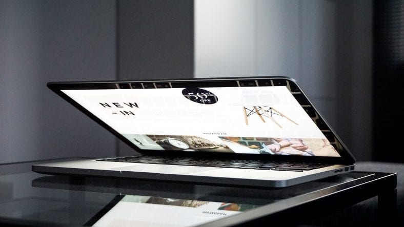
In design The process of creating a website should always start with general ideas. These turn into wireframes or low-fidelity mockups to give the designer a sense of direction. It’s fairly straightforward, but the creative process requires a large visual library of existing layouts to understand which interfaces are usable and well-designed. Navigation is a huge part of web design and deserves a lot more coverage. Responsive Navigation has slightly changed this creative process over recent years. Now designers are much more focused on grids and fluidity. Accessible responsive layouts should be flexible and naturally update to any screen size. Nav menus can be tricky because shortening a collection of links will often require completely revamping the UI….
Original Article Can Be Found Here:

Leave a Reply
You must be logged in to post a comment.